


The sharpness slider in your monitor's settings menu is one of the most misunderstood controls in display technology. Most people assume it works like a camera's sharpness filter, adding real detail to the image. It does not. And the consequences of getting it wrong range from subtle eye fatigue to visibly distorted text and images that look like they have glowing outlines.
This guide explains exactly what the sharpness setting does at a technical level, why the correct setting for most monitors is not maximum, what happens when you push it too far in either direction, and what the optimal values are for gaming, productivity, photo editing, and video. It also covers the broader display calibration settings that work alongside sharpness, brightness, contrast, color temperature, and ClearType to give you a complete visual comfort framework.
Quick Answer
The monitor sharpness setting does not add real detail. It applies an artificial edge-enhancement filter that increases the contrast between adjacent pixels along object boundaries, creating the visual illusion of greater sharpness. Too low and the text looks soft. Too high and edges develop visible white "halos," text becomes fatiguing, and images look artificially outlined. The optimal setting for most monitors running at native resolution is the neutral midpoint, typically 50 on a 0-100 scale or 5 on a 0-10 scale, which applies zero artificial processing. Adjust from there based on your use case.
What the Sharpness Setting Actually Does
Despite the name, monitor sharpness is not a measure of your screen's physical resolution or pixel clarity. Those are fixed properties of the panel hardware. The sharpness slider in your On-Screen Display (OSD) menu is a post-processing filter, a software algorithm your monitor's internal processor applies to the image before displaying it.
The technical name for what this filter does is edge enhancement, sometimes implemented through a technique called unsharp masking. Here is precisely what happens when you move the sharpness slider:
- The monitor's processor scans the image for areas of high contrast where a dark object meets a light background, such as black text on a white page.
- At each of these high-contrast edges, the algorithm artificially darkens the pixels on the dark side and lightens the pixels on the light side.
- This exaggerated local contrast tricks the human eye into perceiving the boundary as more defined — sharper — than it actually is in the original image.
- The result is an illusion of sharpness, not a genuine increase in image detail or resolution. As computer monitor experts confirm, "The sharpness setting increases contrast along the edges of objects. When you turn it up, it makes the dark side of an edge darker and the light side lighter, creating a more pronounced, sharper look."
"The sharpness setting on monitors is an optical illusion created by unsharp masking. It exaggerates the contrast on edges by making the dark side a little darker and the light side a little lighter. Your brain interprets that increased contrast as sharpness, even though all you have done is distort the image. The image looks sharper, but actually contains less information than the original unsharpened image."
Tom's Hardware Technical Forum — Display Engineering Discussion
Why Do Monitors Even Have This Setting?
The sharpness control has a historical origin. In the analog signal era, when monitors used VGA connections, the signal could degrade in transit, resulting in a softer image. The sharpness control was a compensation tool for signal loss. With digital connections (HDMI, DisplayPort), the signal arrives pixel-perfect with no degradation. The control persists largely out of convention, user expectation, and because it does serve a legitimate purpose for non-native resolution content, though its optimal value for digital native-resolution displays is often neutral.

What Happens When Sharpness Is Set Too High or Too Low
Too High: Oversharpening and Halo Effects
According to PixelTest's display calibration guide, oversharpening occurs when the edge enhancement algorithm adds an excessively bright halo on one side of a high-contrast edge and a dark halo on the other. In practice, this produces:
- White outlines around dark text — particularly visible on black text against a white background in Word documents or web pages.
- Bright rings around UI elements — icons, buttons, and interface borders appear to glow slightly.
- Grainy or noisy appearance on photographic images, fine details like skin texture, fabric, and foliage appear artificially textured.
- Eye fatigue over extended sessions — Cevaton's display calibration guide notes that cranking sharpness to 100% creates white halos around text, leading to severe eye fatigue over an eight-hour workday. The brain continuously processes these artificial edge artifacts, increasing visual cognitive load.
- Loss of fine image detail — the edge enhancement filter smooths over delicate features like skin pores, fabric weaves, and film grain. On 4K content, subtle high-frequency detail is erased under fake outlines.
Too Low: Softness and Blur
Setting sharpness below the neutral midpoint may introduce a soft-focus effect on some monitors, depending on whether the sharpness control applies a blur filter below neutral or simply removes the edge enhancement. If your sharpness slider goes to zero and the image appears noticeably soft, not just neutral, but actually blurry, the monitor's neutral point may be above zero. Check your monitor's manual for the neutral value, or use a sharpness test pattern (freely available at sites like Lagom LCD test patterns) to identify the point at which edge halos disappear without image blur.
The Three Sharpness Zones (0 to 100 Scale)
0 to 35 — Soft Zone
Below neutral. May introduce softening or blur on some monitors. Text edges appear less defined. Useful for reducing harshness on upscaled content on some TV-style displays.
40 to 60 — Neutral Zone (Recommended for most users)
The neutral midpoint applies zero or minimal artificial processing. Pixels are rendered as-is. For a monitor running at native resolution with a digital signal, this zone produces the most accurate image representation.
65 to 100 — Oversharpening Zone
Visible halo artifacts around text and edges. Artificial texture on photographic content. Increasing eye fatigue over extended sessions. Only beneficial at modest levels for specific use cases, see the use-case guide below.
Sources: Cevaton Display Guide, PixelTest Calibration Guide, ComputerMonitorPC
Optimal Sharpness Settings by Use Case
The right sharpness setting is not universal. Different tasks benefit from different calibration points. Here is the evidence-based recommendation for each primary use case.
Use Case 01
Office Work, Documents, and Coding
Recommended sharpness: 40 to 50 (neutral to slightly below neutral)
For text-heavy work, Word documents, spreadsheets, email, code editors, the sharpness control should be set at or below neutral. Display calibration experts at Cevaton recommend keeping sharpness low (30-40) for office and coding use, noting that artificial outlines on text cause severe fatigue over eight-hour sessions. At native resolution with a digital signal, text rendering at neutral sharpness is already pixel-perfect. Any artificial edge enhancement adds halo artifacts that the eye must continuously process, increasing fatigue. The goal for productivity use is a clean, undistorted image that requires minimal visual effort to read.
Use Case 02
Gaming
Recommended sharpness: 50 to 65 (neutral to moderately above neutral)
Gaming benefits from slightly higher sharpness in certain genres. In fast-paced first-person shooters and fighting games, a sharpness setting of 55 to 65 can enhance the visibility of character outlines and environmental edges, which improves situational awareness. For racing games, a moderate 50 to 60 maintains clear visuals without compromising the natural appearance of the environment.
The key consideration: gaming sharpness should be tuned by game genre. Games with photorealistic graphics benefit from lower sharpness to preserve natural textures. Stylised or competitive games with flat colour palettes can tolerate higher sharpness without introducing obvious artifacts. Many competitive players also use NVIDIA Image Sharpening or AMD Radeon Image Sharpening (GPU-level sharpening) as a more sophisticated alternative to the monitor's basic edge enhancement.
Use Case 03
Photo and Video Editing
Recommended sharpness: 40 to 50 (neutral)
For photo and video editing, sharpness must be at neutral. Any artificial edge enhancement distorts the image from its true representation; skin tones, fine textures, and colour gradients all appear different from the actual file data. A photographer or video editor looking at a monitor with elevated sharpness is making colour and detail decisions based on a distorted image. For this use case, the monitor sharpness should be set to neutral and left there. Sharpness adjustments to images should be applied in the editing application using tools with precise control (Unsharp Mask in Photoshop, Sharpness in Lightroom), not at the display level.
Use Case 04
Film, Streaming, and Media
Recommended sharpness: 45 to 55 (near-neutral)
For 4K or high-quality 1080p streaming content displayed at native resolution, neutral sharpness preserves the original director's intended image. How-To Geek's display analysis via Yahoo Tech confirms that on 4K content, excessive sharpness is particularly damaging because all the subtle details you paid for, skin pores, fabric weaves, film grain, get erased under artificial outlines. For streaming services displaying compressed content (which is already slightly soft from compression), a small upward adjustment (50 to 60) can partially compensate for compression softening, but should not exceed the point where halo artifacts become visible.
Sharpness Settings Quick Reference
| Use Case | Recommended Range (0-100) | Key Reason |
|---|---|---|
| Office / documents / coding | 30 to 50 | Halo artifacts on text increase fatigue over full workdays |
| Competitive / FPS gaming | 55 to 65 | Boosted edges improve enemy/object visibility at speed |
| Casual / RPG gaming | 50 to 60 | Light enhancement without distorting photorealistic textures |
| Photo editing | 50 (neutral) | Any processing distorts the true image data |
| Video/film editing | 50 (neutral) | Editing decisions must reflect actual footage, not an enhanced version |
| 4K streaming / film | 45 to 55 | High sharpness destroys fine cinematic detail in 4K content |
| Compressed streaming (1080p HD) | 50 to 62 | Modest enhancement partially compensates for compression softening |

How to Calibrate Your Monitor Sharpness: Step by Step
Follow this calibration sequence to find the optimal sharpness setting for your specific monitor.
- Run at native resolution. No sharpness calibration is meaningful if your monitor is not displaying at its native resolution. Check your display settings, Windows: Display Settings > Resolution. Mac: System Settings > Displays. Confirm the resolution marked "(Recommended)" is selected. Non-native resolution introduces blur that no sharpness setting can fix.
- Set sharpness to neutral (50 on a 0-100 scale, 5 on a 0-10 scale). This is your starting baseline. Access your monitor's OSD (On-Screen Display) using the physical buttons on the monitor body or the joystick control typically located below the screen. Navigate to Picture or Image settings.
- Open a sharpness test pattern. Navigate to Lagom's LCD sharpness test in a browser. The pattern displays fine grids and text samples that make halo effects immediately visible. Alternatively, open a document with black text at size 12 on a white background.
- Identify the halo threshold. Increase sharpness slowly from neutral while watching the test pattern or text. At some point, a faint white glow or outline appears around dark elements. This is the oversharpening threshold. Note the value at which this first appears.
- Set sharpness just below the threshold. Your optimal setting is the highest value at which no halo effect is visible. For most monitors at native resolution with a digital connection, this is at or near the neutral midpoint (50). For monitors displaying upscaled content, the threshold may be slightly higher.
- Create separate presets for different uses if your monitor supports it. Many monitors allow multiple picture mode presets (Office, Game, Movie). Calibrate sharpness separately in each preset so you can switch modes rather than manually adjusting for each task.
The Complete Display Calibration Framework
Sharpness is one setting in a broader calibration framework. Each of the following settings interacts with the overall visual quality and eye comfort of your display, and each has a clear optimal range for the conditions most people work in.
Brightness
Display calibration experts recommend targeting 100 to 150 nits of screen brightness for standard indoor office use, roughly 40 to 60% of maximum brightness on most monitors. The goal is to match screen brightness to ambient light in your room. A screen that is significantly brighter than its surroundings forces your pupils to constantly adjust, which is a primary cause of eye fatigue in extended sessions. The practical test: if your screen looks like a light source in the room rather than part of the room, it is too bright. Reduce brightness until the screen surface appears to have similar luminance to the walls around it.
Contrast
Contrast controls the ratio between the darkest black and brightest white the monitor produces. For office and productivity use, the recommended range is 70 to 80% for crisp text without visual fatigue. Avoid "Dynamic Contrast" settings that automatically adjust contrast based on scene content, as this introduces a distracting pulsing effect during normal use. Set contrast manually rather than using any auto or dynamic mode for productivity work.
Color Temperature
Display health guidelines recommend warmer color temperatures in the evening to reduce blue light exposure, particularly before sleep. For standard daytime work, a colour temperature of 6500K (the D65 standard used in professional colour calibration) is the neutral, accurate setting. This appears as a neutral white, neither warm (orange-tinged) nor cool (blue-tinged). In the evening, shift to 5000 to 5500K or enable a blue light reduction mode (Windows Night Light or macOS Night Shift) to reduce melatonin disruption from short-wavelength blue light.
ClearType and Font Smoothing (Windows and Mac)
ClearType is Windows' font-rendering technology that adjusts how text pixels are smoothed based on your specific monitor's pixel layout. It is distinct from the monitor's hardware sharpness setting and works at the operating system level. To calibrate it: open the Start menu, type "ClearType," click "Adjust ClearType text," and follow the wizard. On macOS, font smoothing is applied automatically, but can be adjusted in System Settings > Accessibility > Display. Proper ClearType calibration often produces more noticeable improvement in text clarity than adjusting the monitor's hardware sharpness setting.
Display Scaling and Font Size
Display experts recommend using OS scaling (125 to 150% on Windows) to enlarge text without losing clarity, rather than increasing font size manually in individual applications. Proper OS scaling preserves the sharpness of text rendering because it scales at the system level. Increasing font size without scaling often produces text that is larger but not better rendered. Setting your system scaling to a comfortable reading size reduces the need to lean toward the screen, which in turn reduces eye strain caused by suboptimal viewing distance.
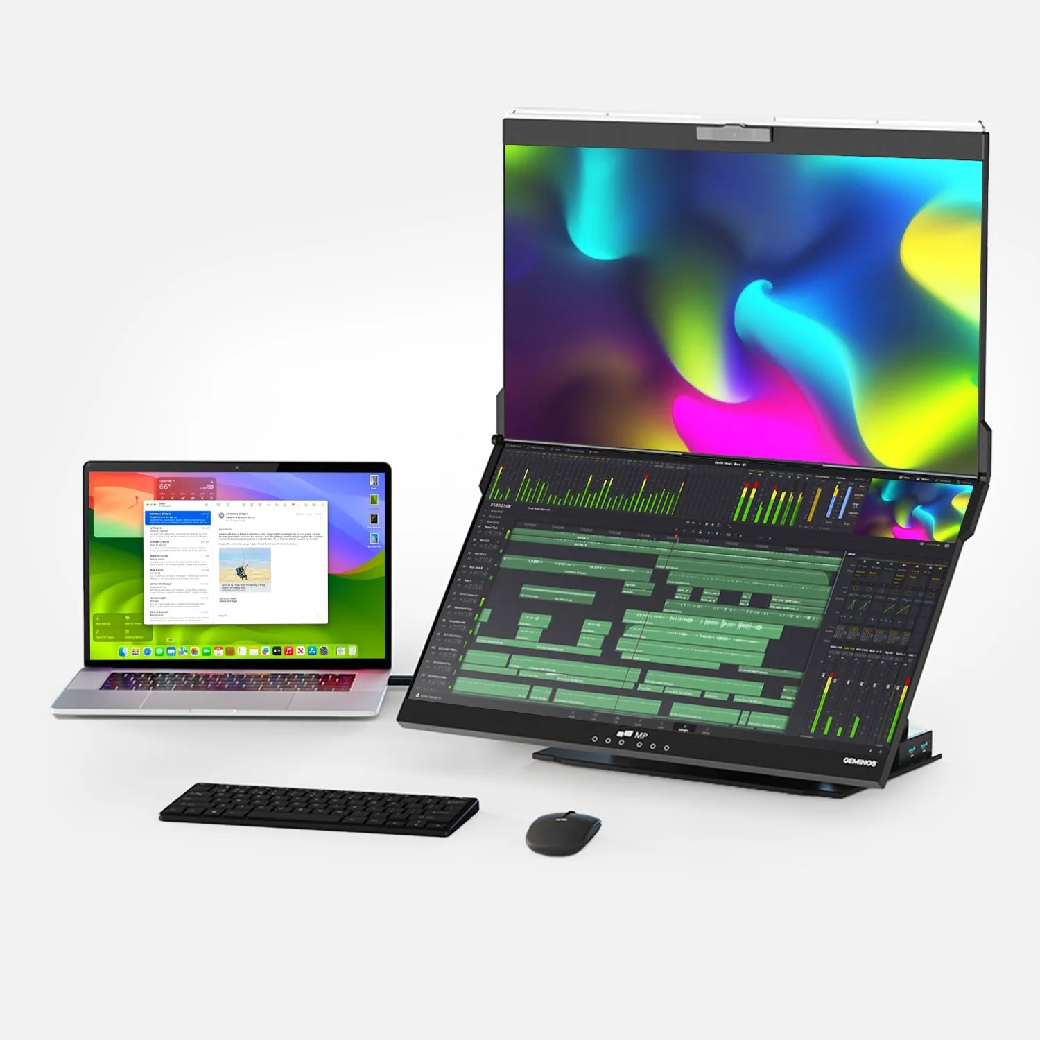
Sharpness on Portable Monitors: What Changes
The same sharpness principles apply to portable monitors, but with one important additional consideration: portable monitors are typically used at a closer viewing distance than desktop monitors, and the viewing angle changes more frequently as you reposition throughout the day.
At close viewing distances typical of a laptop-attached or lap-based portable monitor, halo effects from oversharpening are more visible than on a larger desktop display viewed from arm's length. If you use a portable monitor for productivity work at a close distance, setting sharpness below neutral (35 to 45) is more comfortable than on a larger desk monitor.

For portable monitors with IPS panels, which provide consistent colour accuracy across a range of viewing angles, neutral sharpness is particularly important because colour and edge accuracy are the primary strengths of an IPS display. Artificial edge enhancement undermines the panel's natural quality. If you are working with a Mobile Pixels portable monitor or any quality FHD IPS portable display for document work and productivity, the starting calibration recommendation is sharpness at 45 to 50, with brightness matched to your ambient lighting environment. The IPS panel's inherent pixel clarity at native resolution makes additional sharpening unnecessary and counterproductive.
What Sharpness Cannot Fix
Understanding the limits of the sharpness control saves time and prevents frustration. There are several common image quality issues that people attempt to address with the sharpness slider that it fundamentally cannot resolve:
- Running at non-native resolution. PixelTest's calibration guide confirms that when a monitor displays a non-native resolution, it must upscale the signal, and upscaling always introduces blur. No sharpness setting compensates for this; the blur is embedded in the scaled output. The solution is to always run your monitor at its native resolution.
- A low pixel density panel. A 24-inch HD (720p) monitor will have blurry text at arm's length. This is a hardware limitation; the panel has too few pixels for its physical size. No sharpness adjustment changes the fundamental pixel density of the display. The only resolution is upgrading to a higher-resolution display or using a smaller screen.
- A damaged or loose display cable. Signal degradation from a faulty cable produces a soft, slightly blurred image. This is the one scenario where analog-era sharpness adjustment had some historical use, and it is not a universal solution even there. Replace the cable.
- GPU-output resolution mismatch. If your GPU is outputting at a resolution different from your monitor's native resolution (sometimes caused by incorrect display driver settings), the image will appear soft. Verify in your GPU control panel that the output resolution matches your monitor's native specification.
Complete Display Settings Reference
| Setting | Recommended Value | What to Avoid |
|---|---|---|
| Sharpness | 40-50 (productivity); 55-65 (competitive gaming) | Above 70 for any extended use — causes halo fatigue |
| Brightness | 100-150 nits (match ambient light) | Maximum brightness in a dim room |
| Contrast | 70-80% | Dynamic Contrast (causes brightness pulsing) |
| Color temperature | 6500K daytime; 5000-5500K evening | Cool (9000K+) for extended evening sessions |
| Resolution | Always native resolution for the panel | Any non-native resolution causes permanent blur |
| ClearType (Windows) | Calibrated via ClearType wizard for your panel | Leaving uncalibrated after a new monitor install |
| OS display scaling | 125-150% (use system scaling, not per-app font size) | Non-integer scaling values on Windows (causes blur) |
| Blue light filter | Enabled from sunset; disabled for colour-critical work | Using blue light filter during photo or video editing |
Frequently Asked Questions
What does the sharpness setting on a monitor actually do?
The sharpness setting applies an artificial edge enhancement filter called unsharp masking. It increases the contrast between adjacent pixels at high-contrast boundaries, making the dark side of an edge darker and the light side lighter. This creates the visual illusion of greater sharpness without adding any real image detail or improving the panel's physical resolution. The image appears sharper but technically contains less accurate information than the unprocessed original.
What sharpness setting should I use on my monitor?
For most productivity use at native resolution with a digital connection, the neutral midpoint is typically optimal, 50 on a 0-100 scale or 5 on a 0-10 scale. This applies zero or minimal artificial processing and produces the most accurate image. For competitive gaming, 55 to 65 adds edge definition that can help in fast-paced scenarios. For photo editing, video editing, and high-quality film viewing, stay at neutral (50) to avoid distorting the true image. Never exceed 70 for extended work sessions, as halo artifacts cause progressive eye fatigue.
Is it better to have high or low sharpness on a monitor?
Neither extreme is correct; the optimal setting is the neutral midpoint, where no artificial processing is applied. Very high sharpness creates white halo outlines around text and edges, which is visually fatiguing and distorts images. Very low sharpness may introduce soft blur on some monitors. The correct target is the neutral point at which the image appears clean and accurate without any visible halos. For most monitors, this is near the 50% mark on the sharpness scale.
Does the sharpness setting affect eye strain?
Yes, significantly for extended use. Oversharpening setting sharpness too high creates persistent white halo outlines around text and interface elements. The brain continuously processes these artificial edge artifacts, increasing visual cognitive load without the user being consciously aware of the cause. Display calibration experts specifically identify sharpness above 70% as a significant contributor to eye fatigue over eight-hour workday sessions. For anyone experiencing unexplained eye fatigue during computer use, reducing sharpness to neutral is one of the first calibration steps to try.
Why does my monitor text look blurry even at maximum sharpness?
Blurry text that persists regardless of sharpness setting is almost always caused by one of three things: (1) the monitor is not running at its native resolution check Display Settings and select the "(Recommended)" resolution; (2) ClearType or font smoothing is not calibrated run the ClearType wizard in Windows by searching for "ClearType" in the Start menu; or (3) the monitor is running at a non-integer scaling factor in Windows, which introduces interpolation blur try 100%, 125%, or 150% scaling rather than custom percentages. The sharpness slider cannot fix blur caused by any of these underlying issues.
What is the difference between monitor sharpness and ClearType?
They operate at different levels and use different methods. Monitor sharpness is a hardware-level OSD setting that applies an edge-enhancement filter to the entire image produced by the monitor's internal processor. It affects everything on screen, including photos, videos, and text equally. ClearType is a Windows operating system font rendering technology that uses subpixel anti-aliasing specifically to smooth the edges of text characters, calibrated to your specific monitor's pixel layout. They can and should be calibrated independently. For productivity use: set monitor sharpness to neutral, then calibrate ClearType for your monitor for the clearest text rendering.
Should I use NVIDIA or AMD GPU sharpening instead of monitor sharpness?
GPU-level sharpening (NVIDIA Image Sharpening and AMD Radeon Image Sharpening) is generally more sophisticated than the monitor's built-in sharpness filter. These GPU tools use more advanced algorithms and can be applied selectively per game or application, rather than affecting all display output. The recommended approach is to set monitor sharpness to its neutral midpoint first, then experiment with GPU-level sharpening tools for specific gaming or productivity applications where you want additional edge definition. This gives you more precise control and avoids the double-sharpening that occurs if both settings are elevated simultaneously.
Does sharpness need to be calibrated differently on a 4K monitor?
Yes, slightly. 4K monitors have naturally higher pixel density than 1080p monitors at the same screen size, which produces inherently sharper text and finer image detail. Because the panel's native pixel clarity is already higher, the sharpness slider needs less (or no) upward adjustment to produce a clean, sharp image. Display calibration guidance for 4K screens generally recommends 10 to 15% less artificial sharpening than for 1080p screens. Start lower on the sharpness scale and increase only if the image appears genuinely soft on a 4K display at native resolution; it usually will not.
Discover Tech Gadgets


Leave a comment
All comments are moderated before being published.
This site is protected by hCaptcha and the hCaptcha Privacy Policy and Terms of Service apply.